The Ongoing Debate for Defining Comics – Eisner, McCloud, Meskin and Kunzle

When a new definition of comics is introduced, comic academics and scholars’ debate weather that or any previous definitions actually covers all the aspects needed to constitute a proper definition. Starting with Aaron Meskin’s paper, Defining Comics? [Meskin.2007], these definitions cross over frequently and find themselves in competition.

Meskin begins by discussing the work of Hayman and Pratt, noting that they “attempt to provide a traditional real definition of comics in terms of independently necessary and jointly sufficient conditions for the correct application of the concept comic” [Meskin.2007:01]. However, it’s unclear what he means by “traditional real definition”. This feels like a contradiction and implies that there are false definitions. This could be a reflection on how theorists have come to view the definitions proposed by both Will Eisner and Scott McCloud. The work Meskin is referring to for Hayman and Pratt is What is a Comic?, in which Pratt and Hayman state that “x is a comic if and only if x is a sequence of discrete, juxtaposed pictures that comprise a narrative, either in their own right or when combined with text” [Pratt.2011:369]. This statement suggest that comics must consists of pictures in a sequence. Something that writers such as Roy Cook takes issue with when discussing Batman #663 in his paper Do Comics Require Pictures? Or Why Batman #663 is a Comic [Cook.2011]. Going back to Meskin’s description of “traditional real definition”, it seems that the idea of a comic absolutely needing sequential images is the ‘traditional real’ definition that he was referring to. Something that Meskin further notes when discussing the work of Kunzle.

Bakuman 8 - Page 10

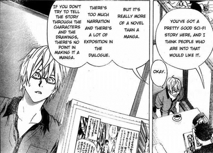
The previous note mentions the place of images as being deeply important to the definition of comics. While Meskin also notes that Kunzle seems to place the morality and topical nature of story above all else, he also discusses the importance of images. “Kunzle characterizes [the images dominance] in terms of what ‘carries the burden of the narrative’ and what is ‘primary’. What does ‘carrying the burden of the narrative’ amount to?” [Meskin.2007:01]. Meskin goes on to add that “perhaps the idea is that audience comprehension of the narrative depends primarily on a grasp of the sequence of images rather than the text” [Meskin.2007:01]. This does heavily imply that images are what should be focused on within comic book theory. However, this disregards the role of the writer and the choice of dialogue within a story. While not based in theory, this argument is made clear early in Ohba and Obata’s Bakuman [Ohba & Obata.2008 – 2012]series. During their first meeting with an editor, Mashiro, a fledgling artist, and Takagi, a new comic writer, receive feedback on their first submission. “Overall, I think this is a well written piece of science fiction, and people who like those kinds of stories would be attracted to it. But this is too much like a novel rather than a manga. There are too many narratives, and the conversations are too explanatory. It’s meaningless to do this in manga form unless you’re able to unfold the story using the art and characters” [Ohba & Obata.2010:016]. While, yes, the editor Hattori is talking about the importance of images, he’s still encouraging the importance of text and writing within comics and manga. The two must be in sync and equally important.

While still on the subject of Kunzle, Meskin begins to bring in the works of both Eisner and McCloud early definitions of comics. Eisner having written about the subject in 1985, with McCloud expanding upon it in 1993. “Comics are, in Eisner’s words, ‘sequential art’, by which he means to pick out a distinctive ‘form of art, or method of expression’. But although dropping the medium and narrative condition might seem attractive given the problems with Kunzle’s account, Eisner’s ‘definition’ if it is really intended to be one, is too thin” [Meskin.2007:02]. This implies that Eisner’s definition, while yes outdated, can’t be fleshed out. Kunzle’s definition states that, according to Meskin “’a sequence of separate images’ with a ‘preponderance of image over text’ that appear (and was originally intended to appear) in ‘a mass medium’ and tells ‘a story which is both moral and topical.’” [Meskin.2007:01]. This definition in fact outdates Eisner’s notes, and implies that the content of a comic is as, if not, more important when it comes to defining it. This means that by Kunzle’s definition, a comic can only tell specific types of stories. Drastically limiting what a comic can be.

Meskin also addresses McCloud’s Understanding Comics [McCloud.1993], criticising his attempt to define the medium. “We shall see that the ahistoricism of McCloud’s account leads it to count far too many things as comics” [Meskin.2007:02]. What Meskin fails to take into account here is that during Understanding Comics, McCloud uses the loose definition Eisner provides and extends it to proves its flaws. He doesn’t reach a full conclusion when it comes to a definition. Instead, he sidesteps the issue by carrying on with Eisner’s notion of simply referring to comics as ‘Sequential Art’ [McCloud.1993:008] [McCloud.1993:009].

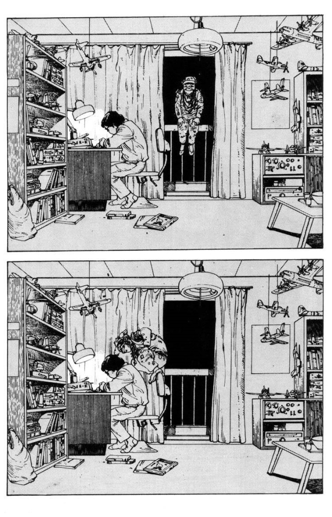
McCloud does discuss the similarities between comics and film strips, “The basic difference is that animation is sequential in time but not spatially juxtaposed as comics are. Each successive frame of a movie is projected on exactly the same space – the screen – while each frame of comics must occupy a different space. Space does for comics what time does for film! However, you might say that before it’s projected, film is just a very, very, very, very, slow comic!” [McCloud.1993:07-08]. McCloud bringing in time is interesting as it is something other definitions seem to neglect. When you apply time to a definition for comics, you are thinking about it the same way as sequential imagery. Comics have the ability to tell a story out of order, the ability to move back and forth between panels is not only a travel sequentially through images but through time. The pages of a comic, either in single issues or in a collected format, exist simultaneously. “A definition that relies on it’s connection to the [time] sidesteps the ongoing debate on image style vs photography, and whether or not the medium must include text or not. It allows for various genres, art styles and the use of both fiction or non-fiction that previous definitions have struggled to overcome” [Laird.2019].The definition including time also helps to distinguish how comics tell a story from how film, novels, or video games.

Previous definitions as well as developing a definition that includes what comics do that other mediums can’t is essential for moving forward in comics academia.

Bibliography:

  • Cook, R. (2011) Do Comics Require Pictures? Or Why Batman #663 Is a Comic. Journal of Aesthetics and Art Criticism, vol 69, No. 3 pp. 285-296.
  • Eisner, W. (1985) Comics and Sequential Art. W.W. Norton & Company: New York.
  • Hayman, G & Pratt, H. (2005) What are Comics? Aesthetics: A Reader in Philosophy of the Arts (Second Edition) pp. 419-424. Routledge: New York.
  • Kunzle, D. (1973) The Early Comic Strip: Narrative Strips and Pictures in the Wuropean Broadsheet from c. 1450 to 1825. University of California Press: Berkley.
  • Laird, M. (2019) Comics as an Expression of 4th Dimensional Storytelling – A New Definition in Progress. [Online] Available from: https://mikaylajlaird.wordpress.com/2019/12/26/comics-as-an-expression-of-4th-dimensional-storytelling-a-new-definition-in-progress/ [Last Accessed: 29.02.2020]
  • Laird, M. (2019) Relativity of Time to Page Count – Comics as Expression of 4th Dimensional Storytelling. [Online] Available from: https://mikaylajlaird.wordpress.com/2019/12/30/relativity-of-time-to-page-count-comics-as-expression-of-4th-dimensional-storytelling/ {last accessed: 29.02.2020]
  • McCloud, S. (1993) Understanding Comics: The Invisible Art. Harper Perennial: New York.
  • Meskin, A. (2007) Defining Comics? The Journal of Aesthetic and Art Criticism. 65:4 Fall, 2007. Pp 369-379.
  • Morrison, G. & Van Fleet, J. (2007) Batman #663: The Clown at Midnight. DC Comics: Burbank.
  • Ohba, T. & Obata, T. (2008 – 2012) Bakuman. Shueisha: Tokyo.
  • Ohba, T. & Obata, T. (2010) Bakuman Vol. 2: Chocolate & Akamru. Shueisha: Tokyo.
  • Pratt, H. (2011) Relating Comics, Cartoons, and Animation. Aesthetics: A Reader in Philosophy of the Arts (Third Edition). Pp 369-372. Routledge: New York.

The Construction of Space in Comics by Pascal Lefevre

Lefevre’s work in regard to space in comics discusses the ways in which space is both viewed and experience within comics. Specifically talking about diegetic space versus extradiegetic space, “visualized versus non-visualized space” [Lefevre.2009:157]. When it comes to diegetic space, he’s specifically talking about semiotic reconstructions of the space, as well as two-dimensional and three-dimensional spatial relativity.

When first discussing diegetic space, Lefevre focuses on the setting in which action is taking place within a comic, discussing that many artists lean heavily on stereotypical design in order to make settings easier for the reader to recognise on site. The examples he uses are specifically the Statue of Liberty in New York and the Pyramids of Egypt [Lefevre.2009:157]. However, when looking at comics of the DC Universe, these landmarks could also be fictional. An example would include the Daily Planet building, Arkham Asylum or the Fortress of Solitude. While the general imagery of a city could be used as a visual signifying for a place such as Gotham City or Metropolis, both cities do have a different aesthetic despite being based off of New York City. As writer and editor Dennis O’Neil states, “Gotham is Manhattan below Fourteenth Street at 3am., November 28th in a cold year. Metropolis is Manhattan between Fourteenth and One Hundred and Tenth Streets on the brightest, sunniest July day of the year” [Pearson & Uricchio.1991:009]. If we were to see Superman in a bright vibrant city, it would be natural to assume that his surroundings are that of Metropolis, while if we were to find him in an equally large city but with a darker, more gothic aesthetic, than the likely conclusion is that he is in Gotham City.

Lefevre also discusses how “space can also suggest other meanings; the way a person has decorated or organized [their] room can suggest something about [their] personality (orderly or messy, classic or modern, etc.). Furthermore, space can express a certain mood or be a symbol for an underlying concept or a scene or even a complete story” [Lefevre.2009:157]. A page and panel in particular that comes to mind is from The Killing Joke. On the books second page, Batman and Commissioner Gordon pass a receptionist’s desk in Arkham Asylum. While the desk is relatively sparse, the desk does contain a single note stating “You don’t have to be crazy to work here – but it helps” [Moore & Bolland.1988:02]. The inclusion of the note on her desk does not add anything to the books plot in any way, but it gives a sense of the overall atmosphere of working at Arkham Asylum. Given the very sick and cruel nature of the story, and the overall emphasis on just one bad day driving you to insanity, to does speak to the tone of the work as a whole.

The Killing Joke [Moore & Bolland.1988:002]

Minor details such as this note may not appear on the previous panel when the camera was focused in the opposite direction, however, it is simply an ‘unseen’ element within the space. It gives the reader a sense of physical, three-dimensional space through these two-dimensional images. This process of building three-dimensional space through two-dimensional images is also built upon through the use of illusionary depth [Lefevre.2009:158]. Lefevre specifically calls out that no matter how the image has been created, “every flat image has to deal with it’s fundamental two-dimensional aspect; the picture can try to deny the flatness” [Lefevre.2009:158] but it will always be presented as a flat, two-dimensional image within the real world and to the reader. A prime example of this would be 1990’s Batman: Digital Justice [Moreno.1990]. The first comic created entirely using computer generated, three-dimensional software, something that is printed on the books front cover, but is still published as a two-dimensional, physical comic book.

Batman: Digital Justice [Moreno.1990]

Another manner in which an image within a panel can denote space or area is through spatial relationships, either through size or shading. “Objects that appear on a flat surface can never show the complete reality of such three-dimensional objects. The flat and unmoving image can only use monocular cues to suggest depth; interposition or overlapping, convergence, relative size, density gradient” [Lefeve.2009:159]. A core example of this done in a single panel would come from The Dark Knight Returns [Miller.1986]. The image is one often referenced of an armour-clad Batman standing in the streets, while Superman floats high above him [Miller.1986:190].The sense of space largely comes from the pairs relative positioning to one another, the size of both characters, and the use of lighting. Batman is firmly positioned on the ground underneath a streetlamp. Batman appears fully lit with defined detail within his design, while Superman appears above, drawn exclusively as a silhouette, denoting that he is far enough away for the light produced to not affect him. The surroundings show a row of buildings on either side, with the vanishing point extending to the horizon. A sense of space is given. We are aware that the pair are in a somewhat narrow street, with minimal lighting. We have a sense of roughly how high Superman is based on the lack of light reaching him, but also the relative size of his body. He is close to Batman on the x axis, but relatively high on the y axis.

The Dark Knight Returns [Miller.1986]

Batman’s positioning within the image does block off part of the row of buildings, this would be overlapping of a character with environment. However, the visual information available provides the reader with enough information to still gain a grasp of the represented three-dimensional space. The decision to make the panel vertical also plays into giving the reader a sense of space. “Furthermore, the visualized space appears within dimensions, and locations on a page. All these aspects can be important for the construction of space” [Lefevre.2009:159]. The choice to present the panel vertically allows the reader to have that sense of scale in regard to Batman and Superman’s positioning. Had the panel been presented horizontally, the idea of Superman above Batman wouldn’t have been presented as clearly, though the background environment would have more of a presence.

Overlaps within a panel, are something Lefevre draws attention to, and as stated previously, exists within the Dark Knight Returns panel. Specifically, in the case of Batman and the background buildings. However, this is especially important when it comes to action scenes. In the centre panel next to the vertical panel, we see Superman going to punch Batman. Due to Superman’s positioning, we can’t fully see Batman’s left leg, or left shoulder. Nor can we completely see the lamppost behind Batman. However, this in itself gives us a sense of three-dimensional space. If the panel borders are the framing of a camera, then we know that Superman is closer to the camera than Batman, who is closer to the camera than the lamppost. In addition to this, thought panels are also blocking part of Superman, which would not appear in reality. The reader is still able to fill in the details of what they are blocking, while still constructing a realistic three-dimensional space.

When it comes to disrupting or perverting this sense of three-dimensional space, an artist can manipulate these effects. Lefevre discusses how “some contradictions of the diegetic space remain unnoticed; usually the suggestion that the various fragments belong together is sufficient for the reader. Scores of comics suggest a coherent diegetic space without giving sufficient proof. Seldom in a sequence are all the corners of one room shown or is a global view of the space presented. The reader’s expectation of a consistent diegetic space is often wrong” [Lefevre.2009:160]. Given that a lot of the work is done subconsciously by the reader, due to implied work done by the artists, artists can take certain liberties when it comes to giving all the information in a room. However, this could be used to great effect when it comes to defying expectations or pervert the sense of space. Using shadows or, omitting some details, only to subvert expectations. With a story that distorts time and space, this would be heavily effective. An example of space being used to create an uncomfortable atmosphere would be in the Crisis Event Dark Nights Metal [Snyder & Capullo.2018]. Typically, when the city of Metropolis is shown, the buildings are tall skyscrapers. The Daily Planet building is shown to be an important part of the Metropolis skyline.

Superman Smashes the Klan #1 [Yang & Gurihiru.2019:09]

Establishing shots for Metropolis draws particular attention to this fact. Always including the Daily Planet within the skyline. Emphasising its size. However, in Dark Nights Metal, this consistency is flipped on its head for the benefit of creating an uneasy atmosphere and showing the corruption of the city. In Dark Nights Metal, a dark construct is erected in various cities. When we see the one erected in Metropolis, the art makes full use of established norms, and portrays the Daily Planet and the rest of the city in a much smaller, far more distant setting [Snyder & Capullo.2018:065]. The image clearly shows the dark construct above the city, dwarfing this vibrant city, and coating it in darkness through its shadow.

Dark Nights Metal [Snyder & Capullo.2018:065]

This view of Metropolis from above also plays into Lefevre’s discussion points on detail and décor. “One has to make a distinction between changes that do not affect the illusion of a consistent diegetic space and those changes that weaken this illusion or belief. Readers accept that not in each panel every detail of the décor is repeated: the décor might appear temporally from the reader’s view to accentuate the actions of the characters” [Lefevre.2009:160]. If we use the Daily Planet building as an example, we can recognise by its shape that it is indeed the Daily Planet, however, we cannot make out the writing on the side of the globe. The effect of the image is not corrupted by the omission of this detail. The focus of the panel is specifically meant to be on Superman, Wonder Woman and the dark construct. The setting of Metropolis below is simply there to give the reader a sense of grounding within this universe. The provided information is enough for the reader.

Lefevre’s final point is on the use of Extradiegetic space within a comic. “the extradiegetic space is the material space that surrounds the individual panels: not only the whites between the panels, but also the real space in which the reader is located” [Lefevre.2009:160]. Panel’s make use of the knowledge that they are on a page, complete with other panels, in most cases. Some pages can consist of a single panel; however, a physical comic will still appear on a page. The page itself will be part of a book, either a single issue, trade paperback, hardcover or oversized, and will be held in the readers hands, or laid flat on a desk. A comic that plays with this idea particularly well is Batman: The Court of Owls. When Batman begins to hallucinate due to being held captive, being drugged and starved, the panels, and indeed the pages orientation begins to morph. Instead of reading the comic left to right, the page needs to be physically turned to give the reader the same feeling of spatial disorientation that Batman feels. Lefevre ends his piece with the statement “During [the] reading process the reader tries to cope with these various aspects of space and to make meaning of it all” [Lefevre.2009:161].

  • Lefevre, P. (2009) The Construction of Space in Comics. A Comic Studies Reader. University Press of Mississippi: Jackson.
  • Miller, F. (1986) The Dark Knight Returns. DC Comics: Burbank.
  • Moore, A. & Bolland, B. (1988) Batman: The Killing Joke. DC Comics: Burbank.
  • Moreno, P. (1990) Batman: Digital Justice. DC Comics: Burbank.
  • Pearson, R & Uricchio, W. (1991) The Many Lives of Batman: Critical Approaches to a Superhero and his Media. BFI Publishing, London: UK.
  • Snyder, S. & Capullo, G. (2018) Dark Nights Metal. DC Comics: Burbank.
  • Yang, G. & Gurihiru. (2019) Superman Smashes the Klan #1. DC Comics: Burbank.

Case study: Haunting over the Shoulder from Domu: A Child’s Dream

Prior to his creation of Akira, Katsuhiro Otomo worked on the suspense filled Domu: A Child’s Dream. A story depicting a psychic nightmare terrorising an apartment complex, with an old man and a little girl at the centre of it all.

Early on in the story, a young man is sat in his room working on model planes. But while he’s working, the old man, essentially the antagonist of the story, appears on his balcony before moving to looking directly over his shoulder without the boy noticing. What makes this so noteworthy is the fact that it is done in just two panels on a single page.

Due to how time progresses in a comic, this one page creates this uneasy state within the reader. Time is usually determined based on context clues. Given that the boy has his light on and outside the window and balcony is dark, we can infer that it is late night or very early morning. But between the two panels, we can’t distinguish how long it too the old man to move, nor how long he was stood there. It could have been a mere matter of seconds, still frightening, but less unsettling. Or, he could have been there for several hours. Slowly making his way over to the boy’s desk. The two panels only show us the beginning and end of his journey.

The first panel also uses it’s local and design to draw heavy attention to the man just floating there. The curtains drawn open and the night sky create a panel within the panel. As we move to the second half of the page, and the second main panel, it’s almost as though the old man has escaped his confines. It suggests that this otherworldly psychic figure could even do this to the primary panels. Appearing behind the reader just as he has the boy in the book.

Relativity of Time to Page Count – Comics as Expression of 4th Dimensional Storytelling

Previously, I’d written about there possibly being a better definition for comics hidden within it’s uses of 4th dimensional storytelling. Using time itself to separate it’s method of telling a story as appose to film or literature. A tangent thought to this has come to mind, the relativity of time to the page count of a comic.

When viewing a film, the run time remains the same. Each frame is on the screen for 1/24th of a second (assuming the film is shot in the standard 24 frames per second format), no frame lasts longer than another. Each frame is exactly 1/24th of a second. With literature, you can take the average time it takes a person to read a full page of text and calculate how long it would take a person to finish a novel. For example, if it took someone 3 minutes for a person to read a page. Then statistically, it should take that same person approximately 3 hours to read 60 pages. This is just a guess depending on the readers speed, but the line of thinking is clear. You can quantify how long it would take someone to read a page.

With comics however, the is no such correlation.

The medium of comics is told with both words and images. However, this does not mean that every page must include both. Take for example, the story line The Many Deaths of Batman found in Batman #433-435. If the same logic of time applied to these comics that do to literature or film, then each of these issues for the story should take the exact same amount of time to read. This is false. The opening issue of the story is entirely silent, with the exception of the words “Get Out” spoken by Jim Gordon. The measurement of time in relation to speed the person reads written words is now null and void. Instead, the time to read the issue is now dependant on how long the person spends on each image.

  • Byrne, J. & Aparo, J. (1989) Batman #433: The Many Deaths of Batman Part I. DC Comics: Burbank.
  • Byrne, J. & Aparo, J. (1989) Batman #434: The Many Deaths of Batman Part II. DC Comics: Burbank.
  • Byrne, J. & Aparo, J. (1989) Batman #435: The Many Deaths of Batman Part III. DC Comics: Burbank.

Justice League Vol 1: The Totality (2018) & Justice League Odyssey Vol 1. The Ghost Sector (2019) || Superhero 4th Diemension Study

Justice League Vol 1 The Totality (2018):

There seem to be five key elements in The Totality that fit well with the research. The Boardroom for the Justice League, a mental projection primarily created by Martian Manhunter and linked to the other league members [Snyder & Cheung.2018:12]. The use of corporeal energy appearing across time and space [Snyder & Jimenez.2018:02 & 04], a use of distinctive superspeed time [Snyder & Jimenez.2018:04], an example of ‘BOOM’ taking the place of the panels [Snyder & Cheung.2018:07], and Luthor being teleported away from the Totality [Snyder & Cheung.2018:13].

The boardroom is an interesting idea that I’m hopeful will be used later. However, in this first instance there isn’t an interesting way in which the characters enter it, or the panel structure plays with it. This is something to really keep an eye on, as it’s possible that since this is just the first use, it will be improved moving forward.

Corporeal energy is used twice in the same issue but are distinguished by two different colours which does separate out their uses. Swamp Thing and Batman both appear to John Stewart attempting to convey a message from Martian Manhunter. The art depicts them both with a blue aura and clearly not flesh. The texture on them feels alien. They almost have a ghostly appearance which in itself gives off an otherworldly feel to the reader. With the door that appears to Luthor in Kansas, it glows with a purple aura. Luthor and a lot of the DC villains have been linked to the colour purple, so this does convey to the audience that not only is the door otherworldly, but also that it’s not to be trusted.

The use of distinctive superspeed time is very limited here, as the Speed Force is currently disrupted. Noticeably, when Flash is using his speed, he appears between panels.

We see the ‘BOOM’ panel happen again here as it did in Justice League: The Darkseid War [Johns & Fabok.2015]. However, it’s questionable as to whether this was created with Boom Tube technology, or just an ordinary explosion. A Boom Tube does later form when Starman arrives, and it does use a similar effect. So what was this one for?

Finally, when Hawkgirl beats Luthor to the Totality, the panel is engulfed in white and continues on down the page until another panel finally appears of Luthor in the exact same position, but in a new location. Time and space is played with and this is perfectly mirrored in the layout of the page.

  • Johns, G. & Fabok, J. (2015) Justice League: The Darkseid War. DC Comics: Burbank.
  • Snyder, S., Jimenez, J. & Cheung, J. (2018) Justice League Vol. 1: The Totality. DC Comics: Burbank.
  • Snyder, S. & Cheung, J. (2018) Justice League #1: The Totality Part 1. DC Comics: Burbank.
  • Snyder, S. & Jimenez, J. (2018) Justice League #2: The Totality Part 2. DC Comics: Burbank
  • Snyder, S. & Cheung, J. (2018) Justice League #7: The Totality – Conclusion. DC Comics: Burbank.

Justice League Odyssey Vol 1. The Ghost Sector (2019):

The primary instance where this book becomes useful for research is in its fifth issue. Multiple levels of cosmic reality reveal themselves to Cyborg. The overlay of images shows that all of this is happening at once, but shows ,at minimum, three different perspectives [Williamson & Giandomenico.2019:12-13].

  • Williamson, J. et al (2019) Justice League Odyssey Vol. 1: The Ghost Sector. DC Comics: Burbank.
  • Williamson, J. & Giandomenico, C. (2019) Justice League Odyssey #5: Ghost Sector Part 5. DC Comics: Burbank.

Comics as an Expression of 4th Dimensional Storytelling – A New Definition in Progress

Comics as a respected medium are often seen as lesser than literature or film studies, and especially so in the case of fine art. They are fighting for their place in legitimate studies with many notable academics dedicated to the medium, and tremendous stories that will stand the test of time. The means of defining the medium comes from how it is similar and how it is not like other medium. It’s visual like art and film, though is clearly not animation. It uses sequential art, but so do film and animation reels. What cursory definitions seem to neglect however is comics’ experience with the 4th dimension.

When it comes to the 4th dimension, theoretically we are able to explore time the same way we explore directions. Moving backwards and forwards like stepping between rooms. How comics use this is the same way. The pages of a comic, either in single issues or in a collected format, exist simultaneously. You can travel to any moment of the story simply by moving backwards and forwards. As simple as moving in a direction physically. A common argument when it comes to definitions of comics is the comparison to animation cells and film reels. However, their intended method of viewing denies the freedom of 4th dimensional thinking. They are dependant on time. While you can fast forward or rewind, it is still bound to time to tell it’s story.

A definition that relies on it’s connection to the 4th dimension sidesteps the ongoing debate on image style vs photography, and whether or not the medium must include text or not. It allows for various genres, art styles and the use of both fiction or non-fiction that previous definitions have struggled to overcome.

The definition I propose is a series of sequential images that convey a narrative while interdependent of the 4th dimension.

  • Carrier, D. (2000) The Aesthetics of Comics. Penn State University Press: USA.
  • Hayman, G.& Pratt, H. (2005) What Are Comics? A Reader in Philosophy of the Arts, Pearson Education Inc. 2005, pp. 419–424.
  • Kunzle, D. (1973) The Early Comic Strip: Narrative Strips and Picture Stories. European Broadsheet. University of California Press, p. 2.
  • McCloud, S. (1993) Understanding Comics: The Invisible Art. Kitchen Sink Press: Massachusetts
  • Meskin, A. (2007) Defining Comics? The Journal of Aesthetic and Art Criticism 65:4 Fall, 2007. pp.369-379
  • Morrison, G. et al. (2015) The Multiversity. DC Comics: Burbank

Justice Leauge: The Darkseid War (2015) || Superhero 4th Dimension Study

The two biggest points of reference throughout Justice League: The Darkseid War in regards to 4th dimensional thinking in comics, are the use of Boom Tubes and the Mobius Chair. While it does include elements of intertextuality to older stories such as Crisis on Infinite Earths, Zero Hour: Crisis in Time and Flashpoint. The primary point of reference in this study is how the comic depicts the use of Boom Tubes to change location. Due to DC’s own lore, Apokolips and New Genesis exist on a higher plain of existence than the multiverse. The use of a Boom Tube not only changes your location, but the size of those using them to appropriately fit with their dimensional environment. The amount of energy needed to do this needs to be conveyed along with the fact that the characters are transporting themselves from one location to another. Throughout The Darkseid War, when a Boom Tube is used, the panel structure reflects this by using the word “BOOM” as it’s panels. Having the image appear within the word. While the image varies depending on who and why the Boom Tube is in operation, the “BOOM” effect is still in place with the image largely giving off a yellow glow within.

The primary questions to take away from this involve the use of words as panel boarders, and the colour of energy relating to transportation. Do specific colours correlate to dimensional/time travel? Does the method of transportation matter?

Speaking of transportation, another element to look at is the use of the Mobius Chair used by both Metron and Batman. The chair has the ability to travel through dimensions as a side effect, though it’s primary concern is for information. When it travels, it gives off a light blue aura. Is this reflected elsewhere?

Do previous or later examples of the Boom Tube or the Mobius Chair reflect what is seen in The Darkseid War?

  • Johns, G. & Fabok, J. (2015) Justice League: The Darkseid War. DC Comics: Burbank.
  • Johns, G. & Kubert, A. (2011) Flashpoint. DC Comics: Burbank.
  • Jurgens, D. & Orway, J. (1994) Zero Hour: Crisis on Infinite Earths. DC Comics: Burbank.
  • Wolfman, M. & Perez, G. (1986) Crisis on Infinite Earths. DC Comics: Burbank.

The Use of Varying Art Styles to Convey a Character Coming from a Different Time Period. Case Study: Superman: The Man of Steel #37: Bats (1994)

The Man of Steel #37 [Simonson & Bogdanove.1994] acts as a tie in to the then current event comic Zero Hour: Crisis in Time [Jurgens & Ordway.1994]. As such, the issue deals with the fall out of the event, and how time is being disrupted. In this case, the focus is on variations of Batman being disrupted through time and showing up in Metropolis. Interestingly, the issue doesn’t just use an intertextual approach by changing Batman’s costume to match the reference, which would have been the simplest option. But instead, they chose to render these various Batmen in a style that replicates the eras they are from. Noticeably, the work of Neal Adams, Frank Miller and Bob Kane.

For an early 70s interpretation, the creative team chose to mimic the work of Neal Adams. One of the minds behind Batman villains Man-Bat [Robbins & Adams.1970] and Ra’s Al Ghul [O’Neil & Adams.1971], as well as the artist behind the landmark issue The Joker’s Five-Way Revenge! [O’Neil & Adams.1973]. Neal’s style is heavily detailed, which was uncommon for the era, but his work is so intrinsically tied to that period in comics, especially given the works Superman vs. Muhammad Ali [O’Neil & Adams.1978], and Green Lantern/Green Arrow #85: Snowbirds Don’t Fly [O’Neil & Adams.1971]. In Man of Steel #37, the art emulates Adams’s style, most noticeably in the use of facial expressions. Layouts even attempt to mimic Adams’s issues when specifically focused on his Batman.

The appearance of a Frank Miller inspired Batman is interesting. While clearly taken from The Dark Knight Returns [Miller & Janson.1986], which was released in 1986, the story itself is set in the future with a much older Batman.This is used to great effect though, as it allows the ‘breaking of time’ theme to feel less one sided and firmly routed in the past. For including Miller’s style, the colouring in particular is well used. Using not only a similar palette, but it’s uses of shading.

Finally, the inclusion of the Bob Kane interpretation from Batman’s first appearance, Detective Comics #27 [Finger & Kane.1939]. This version is perhaps the most obvious. The heavily simplistic style, and drastic change in costume make his appearance stand out far more than any of the other incarnations.

Taking these creators specifically seems to be the most appropriate when discussing a character like Batman through time. His first appearance, his rise in popularity, and arguably his most well-known issue. The specific use of art style however, directly evokes these issues, and gives the reader a greater sense of the character being taken out of time. However, the question now arises. If this were a readers first experience of the character, would they get that they are from different eras just by looking at the style? When it comes to the first appearance Batman, it’s highly likely given the simplistic style. With Adams, I feel that this is less noticeable given how detailed his artwork is. While it’s certainly different from the main style of the issue, it’s not that dissimilar from other works you would find in the mid-90s. Finally, with Miller, the link between time would come more from the rendering of Batman himself. He appears bigger and generally older than the others.

  • Finger, B. & Kane, B. (1939) Detective Comics #27: The Case of the Chemical Syndicate. DC Comics: Burbank.
  • Jurgens, D. & Ordway, J. (1994) Zero Hour: Crisis in Time. DC Comics: Burbank
  • Miller, F. & Janson, K. (1986) The Dark Knight Returns. DC Comics: Burbank.
  • O’Neil, D. & Adams, N. (1971) Batman #232: Daughter of the Demon. DC Comics: Burbank.
  • O’Neil, D. & Adams, N. (1971) Green Lantern/Green Arrow #85: Snowbirds Don’t Fly. DC Comics: Burbank.
  • O’Neil, D. & Adams, N. (1973) Batman #251: The Joker’s Five-Way Revenge! DC Comics: Burbank.
  • O’Neil, D. & Adams, N. (1978) Superman Vs. Muhammad Ali. DC Comics: Burbank.
  • Robbins, F. & Adams, N. (1970) Detective Comics #400. DC Comics: Burbank
  • Simonson, L. & Bogdanove, J. (1994) Superman: The Man of Steel #37: Bats! DC Comics: Burbank

Case Study: Justice League/Black Hammer #1 (2019) pg. 14

The page itself is set up to show The Stranger standing before both the cast of Black Hammer and the Justice League. The Black Hammer cast to his left, and the JLA to his right. The page separates into a 4-panel layout, conveying the time it takes for his magic to take effect. As indicated by the light radiating from The Stranger becoming brighter between panels. As the text would be read in the same order despite the panel break down, we can conclude that the choice of panel layout is to solely convey the gradual use of magic.

The final panel border in this layout noticeably appears lighter and less defined. As this is where the Stranger’s magic fully takes effect, and its purpose is to transport both groups away from their respective time and dimensions, the panel border dissolving is highly appropriate. Especially given the full page spread on the next page. The only way this effect would be stronger, is if the bottom left panel border began to show this effect as well.

When dividing the page vertically, the world of Black Hammer appears on the left, while the DC Universe appears on the right. Aside from the obvious difference in characters, the artists and colourists make a very clear distinction between the time periods and dimensions. The DC Universe, including the characters costumes, the building, and sky consist of a brighter, very hopeful pallet. While in contrast, the Black Hammer universe appears darker, using more muted tones and a lot of blues. The most direct comparison is the blue on Superman’s costume, the blue of Abe’s shirt, the red of both Wonder Woman’s costume and Superman’s cape, and the red of Gail’s jumper and Barbalien’s skin. Having these comparisons, hammers in the effect the colouring has.

  • Lemire, J. & Walsh, M. (2019) Justice League/Black Hammer #1. Dark Horse Comics & DC Comics: Burbank.

Temporal Auditory Awareness, Iggy Pop, and Watchmen

Early in the first issue of Alan Moore and Dave Gibbons’ Watchmen, Daniel Dreiberg, the second Nite Owl, walks home through the dark streets of New York. As he does, he passes a pair of punks listening to music on their boombox. While it doesn’t begin at the start of the song, nor during a recognisable chorus, we do see a portion of the lyrics. “… Look down your back stairs, buddy, somebody’s living there an’ they don’t really feel the weather….” [Moore & Gibbons.1987:018]. Enough of the lyrics are shown for the song to be recognised. Neighbourhood Threat by Iggy Pop, though a version by David Bowie does also exist.

The song was originally released in 1977 on the album Lust for Life [Pop.1977]. The lines shown here come in at 0:33 until 0:43. Exactly 10 seconds. Noticeably, the lyrics and its speech bubble only appear on this one panel. Comparing this to later examples, when Laurie and Dan attempt to have sex later on, the television playing in the background carries over panels [Moore & Gibbons.1987:226]. Having the lyrics appear in just this one panel implies that it is only playing here. The question is, does the panel last for 10 seconds? Or, does it take Dan 10 seconds to get from this position, to the position in the next panel?

As Cohn states in his paper Pow, Punch, Pika and Chu, “sound effects use the same structural features as ‘regular’ text in captions, speech balloons, or thought bubbles. All of these representations have three primary structural features […] the carrier (the thing holding the text), the root producing the sound, and the tail connecting the two” [Cohn. Et al.2016:094]. In this case, the carrier is the music, and the root is the boombox on the punks’ shoulders. Cohn goes on to say that, “whether a carrier has a wavy, jagged, square or other shaped border may determine additional specificity about its meaning. For example, jagged edges mean loudness, whether used for ‘yelling’ in speech balloons or a loud sound of a sound effect” [Cohn.2016:095]. The carrier coming from the boombox is noticeably jagged. Implying that the punks are playing their music at a high level.

Given the time of night, the emptiness of the streets and the volume of the music. It is unlikely that these 10 seconds are all that Dan could physically hear, but they are the only 10 seconds made known to us the reader. With the available information, I like to think of this as ‘Temporal Auditory Awareness’. While Dan could possibly hear the music from further away, and even as he was leaving the area. These 10 seconds are the ones in which Dan was conscious of the song enough to catch the lyrics.

  • Cohn, N. et al. (2016) Pow, Punch, Pika and Chu: The Structure of sound Effects in Genres of American Comics and Japanese Manga. Multimodal Communication. 5(2) pp. 93-109.
  • Moore, A. & Gibbons, D. (1987) Watchmen. DC Comics: Burbank.
  • Pop, I. (1977) ‘Neighbourhood Threat’ Lust for Life. [CD] RCA: West Berlin.